Improve documentation
-
@Jurgen-Goedbloed said in Improve documentation:
I think that for the domain fogproject.org a DNS CNAME record should be made:
docs.fogproject.org IN CNAME readthedocs.ioWe have NGINX running on our webserver. I just had a quick look at the config and for https://docs.fogproject.org we have a proxy_pass (reverse proxy) setting to https://fogproject.readthedocs.io:443
When loading the page I get this in the error logs:
2020/10/07 15:02:08 [error] 26062#26062: *2758 connect() to [2606:4700::6811:2052]:443 failed (101: Network is unreachable) while connecting to upstream, client: 91.18.10.171, server: docs.fogproject.org, request: "GET / HTTP/2.0", upstream: "https://[2606:4700::6811:2052]:443/", host: "docs.fogproject.org"Interesting it resolves to an IPv6 address but is unable to connect to that. I will take a look at this tomorrow morning.
-
@Sebastian-Roth @Jurgen-Goedbloed
I believe that fogproject uses cloudflare. There’s a note about using cloudflare dns in the readthedocs docs.
https://docs.readthedocs.io/en/stable/custom_domains.html?highlight=domains#notes-for-cloudflare-dns-usersDoesn’t look like we’re getting that same error as described in their documentation but may still be related.
I think that reverseproxy might be what Joe set up 3 years ago but it looks like that feature is depreciated. https://docs.readthedocs.io/en/stable/custom_domains.html?highlight=domains#proxy-ssl
-
@JJ-Fullmer Thanks for the hint! Seems like reverse proxy setup was used earlier but now readthedocs is able to provide SSL certificates for external domains (interesting concept I find) through cloudflare. We’ll setup a CNAME soon and und the meantime we’ll use https://fogproject.readthedocs.io/
-
@Sebastian-Roth @Wayne-Workman @Jurgen-Goedbloed
So I’m going through the management section of the wiki, trying to do one page/section a day converting them to the new one. Going back through and updating them will be a separate thing I think.
There are some old flash video tutorials hosted in places like http://freeghost.sourceforge.net/videotutorials/hostinfo.htmlDo we want to recreate these in a newer not about to be depreciated format? And with the new gui?
We could also just host them in github, especially for ones that don’t require sound and can just be .gif files.For now I can just embed the old links, but especially these flash ones probably need to be updated or removed, we should just have a standard as we migrate I think. There’s also the factor that the fog gui will change again in 1.6.
-
@JJ-Fullmer can they be converted to something YouTube supports? (as opposed to re-recording)
We can put them on the FOG Project Videos YouTube channel. https://www.youtube.com/channel/UCrvOQPcm1SDIfIrzWZ9K3bA/videos
-
@JJ-Fullmer Thanks you are pushing this forward way quicker than I would have imagined.
especially for ones that don’t require sound and can just be .gif files.
While I really like the idea of keeping things as simple as possible I wonder if GIF is helpful with content that you might want to pause or skip through.
There’s also the factor that the fog gui will change again in 1.6.
That’s a good point. We might want to wait with updating the video stuff until 1.6 is on the doorstep. Just my 50 cents.
-
@Wayne-Workman said in Improve documentation:
@JJ-Fullmer can they be converted to something YouTube supports? (as opposed to re-recording)
We can put them on the FOG Project Videos YouTube channel. https://www.youtube.com/channel/UCrvOQPcm1SDIfIrzWZ9K3bA/videos
I think this would be an excellent method, gives us extra search visibility too.
@Sebastian-Roth Good point on the gif. I was just thinking of what I’ve seen in other documentation recently. It’s cool for showing how quick and easy some things are but pause buttons are nice.
Read-the-docs has a youtube video embedded in their docs so I took that as an example and did a test with a random youtube video from our channel
https://fogproject.readthedocs.io/en/latest/management/index.html#hostsLooks good to me.
I am having trouble getting the swf converted though. When I run it through handbrake or any online convert tool it comes out as a jumbled mess. It’s also a video showing the 0.12 fog gui. Maybe it’s not worth it, I very much doubt anyone uses that version anymore.
-
Well I found one video converter that worked. But it was just the trial of it so I only got half of the video. They want $45 though.
https://www.faasoft.com/video-converter.htmlNot sure if that’s worth it for the flash videos of the pre 1.0 fog gui.
-
@JJ-Fullmer said in Improve documentation:
Not sure if that’s worth it for the flash videos of the pre 1.0 fog gui.
I don’t think it’s worth it. We need to create a new one anyway.
-
agree with Sebastian. Just link to the old video. When it dies, it dies.
-
I am now working on the installation part of the manual.
Can we agree on the starting point that, when coping things from the wiki to the new documentation that we will only focus on the current (1.5.9) version? So all parts that refer to old versions will not be copied and that we will also use screenshots of the current version. I think this will help a lot in understanding and recognition for new Fog users.
-
@Jurgen-Goedbloed said in Improve documentation:
Can we agree on the starting point that, when coping things from the wiki to the new documentation that we will only focus on the current (1.5.9) version? So all parts that refer to old versions will not be copied and that we will also use screenshots of the current version. I think this will help a lot in understanding and recognition for new Fog users.
Absolutely I would say! We encourage people to update to the latest official version over and over in the forums. So it’s fair enough to only provide documentation for that as well.
-
@Sebastian-Roth @Jurgen-Goedbloed
I partly agree.
I’m mostly using the move to get used to rst rather than read through every single line to update as I go. I’ll try to adopt this mentality as a focus though, maybe that’s a better way anyway.But as for screenshots see my slack message. If we use a universal image definition file we can easily update screenshots in one place as the ui changes, which I believe will work very well with the versioning. Then once all is moved over we mark it as a release of ‘pre 1.5.9’ and then update all the rest and release as 1.5.9. Maybe I’m being overly optimistic about how fast it’ll be converted though. There are a lot of sections in that wiki beyond the top level.
-
@Wayne-Workman Just thought you’d appreciate this.
I added a video from the channel to the snapin management page https://fogproject.readthedocs.io/en/latest/management/index.html#snapin-management -
@Sebastian-Roth @Tom-Elliott
Am I correct in that we no longer use the mobile versions of pages and we just use responsive css to make the fog management page at least somewhat universally friendly. And that this is meant to be improved more so in the 1.6 UI?
I’m asking in reference to converting this section https://wiki.fogproject.org/wiki/index.php?title=Managing_FOG#Mobile_Management_Interface
I’m thinking that it could all be replaced with just a note about the page using responsive.css. -
@Wayne-Workman Do you know if there are some orphaned wiki pages? Or rather how to find the parent of a wiki page? I’m finding links to pages like this one https://wiki.fogproject.org/wiki/index.php?title=Creating_a_Samba_Based_Printer_Store_on_FOG
Granted this one might need a little updating, but even still I’m not sure where it’s home should be. Should this be in a Knowledge Base Section? A reference section? As far as I know, you’re the resident wiki expert so I thought you might have insights.
-
@JJ-Fullmer Probably you’ll find a fair amount of those kind of topics in the wiki. I’d hope this is a good chance to get rid of some dated stuff as well. The one you mentioned about samba is 10 years old, talking about Ubuntu 10.04 (!) and I am not sure if people really have those kind of setups. Anyone an idea?
-
If you look at the history on that one, it was added by “admin” in 2010 (probably by @Chuck-Syperski). I don’t remember seeing this article before.
When I was doing printers with fog (which works great last I used it), I just made a share on the Windows server to hold drivers, accessible anonymously.
This article is newer and better suited for creating samba shares: https://wiki.fogproject.org/wiki/index.php?title=Password_Protected_Samba_Share
I wrote that in 2016 when there wasn’t even RHEL 8/CentOS 8, but had foresight to add the correct commands.
-
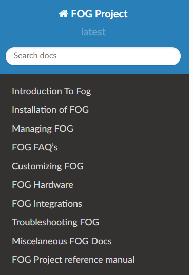
I made a draft of a top level tree
I think we may need subfolders beyond this rather than including everything in one sectioned out page like we’re doing for the installation and management sections.

I’d appreciate some feedback. I was thinking 10 top level categories is a good limit, but will everything fit into these categories.
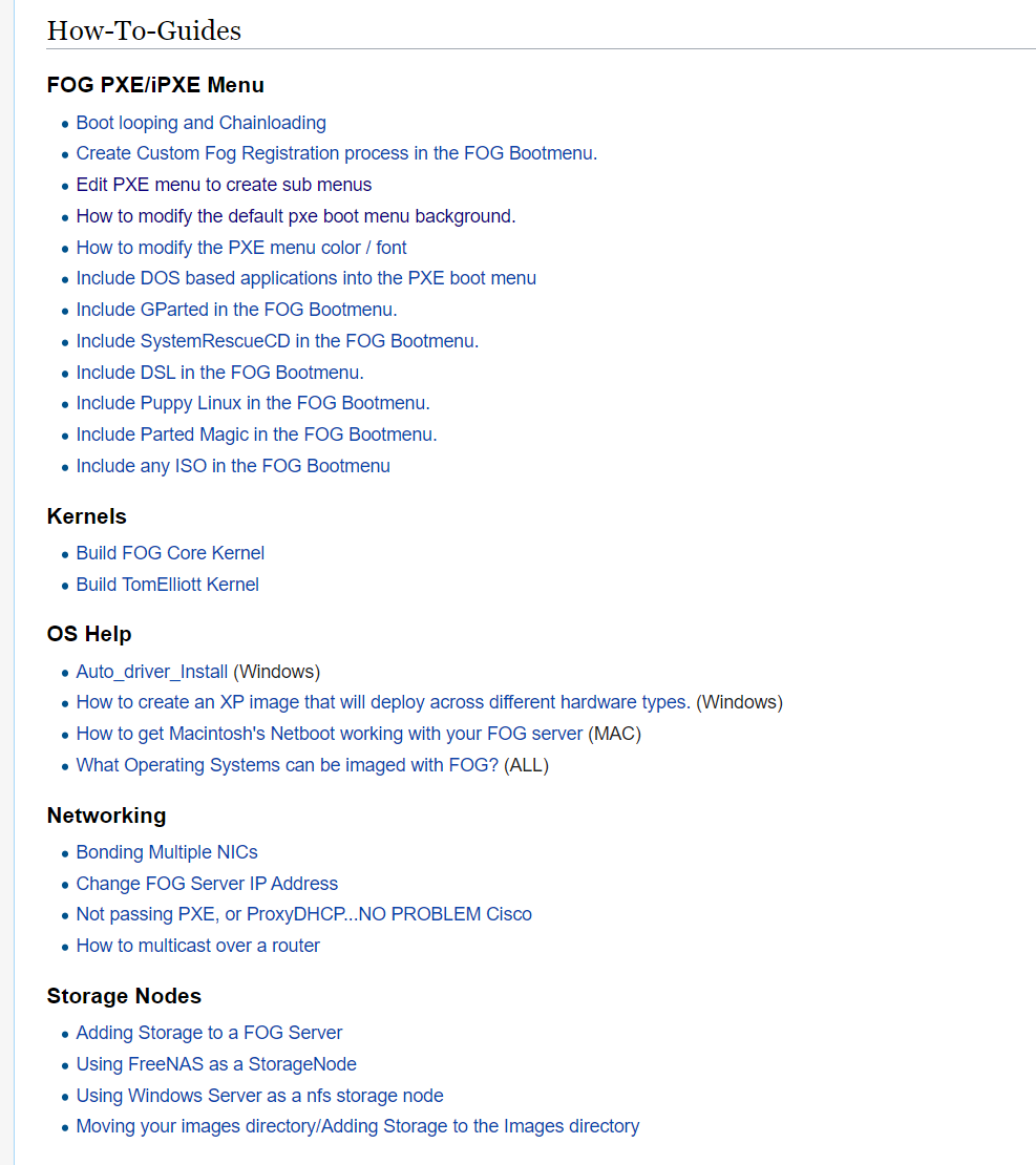
And then will we need to add another heading level to split out any sub categories. i.e. in the wiki there is a how-to guide section outlined like this
each link being an individual page. We could probably combine each of those headings into a single grouped index page the way we’re doing the current pages. But they would each have another subfolder in one of the top level folders. i.e.
customization\ipxewould have an index.rst that would combine all the pages underFOG PXE/iPXE MenuBut we currently are breaking documents into their own rst files at the heading 2 level, but we probably don’t want a gigantic customization page even with navigation. Perhaps we have some more pages like the root index.
Or maybe we should just follow examples of existing pages like https://docs.readthedocs.io/en/stable/index.html and giving a bigger overview at the top level and maintain the title/sub-title level navigation sections throughout on the left panel.
Just trying to get this right before we’re in too deep and changing it becomes a huge pain.
-
Sub-folders sound fine.
Where might these fit in?