Improve documentation
-
I am now working on the installation part of the manual.
Can we agree on the starting point that, when coping things from the wiki to the new documentation that we will only focus on the current (1.5.9) version? So all parts that refer to old versions will not be copied and that we will also use screenshots of the current version. I think this will help a lot in understanding and recognition for new Fog users.
-
@Jurgen-Goedbloed said in Improve documentation:
Can we agree on the starting point that, when coping things from the wiki to the new documentation that we will only focus on the current (1.5.9) version? So all parts that refer to old versions will not be copied and that we will also use screenshots of the current version. I think this will help a lot in understanding and recognition for new Fog users.
Absolutely I would say! We encourage people to update to the latest official version over and over in the forums. So it’s fair enough to only provide documentation for that as well.
-
@Sebastian-Roth @Jurgen-Goedbloed
I partly agree.
I’m mostly using the move to get used to rst rather than read through every single line to update as I go. I’ll try to adopt this mentality as a focus though, maybe that’s a better way anyway.But as for screenshots see my slack message. If we use a universal image definition file we can easily update screenshots in one place as the ui changes, which I believe will work very well with the versioning. Then once all is moved over we mark it as a release of ‘pre 1.5.9’ and then update all the rest and release as 1.5.9. Maybe I’m being overly optimistic about how fast it’ll be converted though. There are a lot of sections in that wiki beyond the top level.
-
@Wayne-Workman Just thought you’d appreciate this.
I added a video from the channel to the snapin management page https://fogproject.readthedocs.io/en/latest/management/index.html#snapin-management -
@Sebastian-Roth @Tom-Elliott
Am I correct in that we no longer use the mobile versions of pages and we just use responsive css to make the fog management page at least somewhat universally friendly. And that this is meant to be improved more so in the 1.6 UI?
I’m asking in reference to converting this section https://wiki.fogproject.org/wiki/index.php?title=Managing_FOG#Mobile_Management_Interface
I’m thinking that it could all be replaced with just a note about the page using responsive.css. -
@Wayne-Workman Do you know if there are some orphaned wiki pages? Or rather how to find the parent of a wiki page? I’m finding links to pages like this one https://wiki.fogproject.org/wiki/index.php?title=Creating_a_Samba_Based_Printer_Store_on_FOG
Granted this one might need a little updating, but even still I’m not sure where it’s home should be. Should this be in a Knowledge Base Section? A reference section? As far as I know, you’re the resident wiki expert so I thought you might have insights.
-
@JJ-Fullmer Probably you’ll find a fair amount of those kind of topics in the wiki. I’d hope this is a good chance to get rid of some dated stuff as well. The one you mentioned about samba is 10 years old, talking about Ubuntu 10.04 (!) and I am not sure if people really have those kind of setups. Anyone an idea?
-
If you look at the history on that one, it was added by “admin” in 2010 (probably by @Chuck-Syperski). I don’t remember seeing this article before.
When I was doing printers with fog (which works great last I used it), I just made a share on the Windows server to hold drivers, accessible anonymously.
This article is newer and better suited for creating samba shares: https://wiki.fogproject.org/wiki/index.php?title=Password_Protected_Samba_Share
I wrote that in 2016 when there wasn’t even RHEL 8/CentOS 8, but had foresight to add the correct commands.
-
I made a draft of a top level tree
I think we may need subfolders beyond this rather than including everything in one sectioned out page like we’re doing for the installation and management sections.
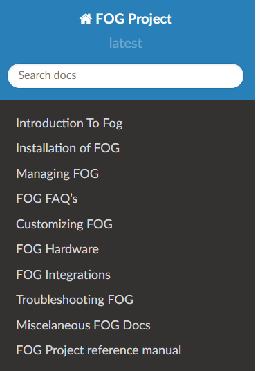
I’d appreciate some feedback. I was thinking 10 top level categories is a good limit, but will everything fit into these categories.
And then will we need to add another heading level to split out any sub categories. i.e. in the wiki there is a how-to guide section outlined like this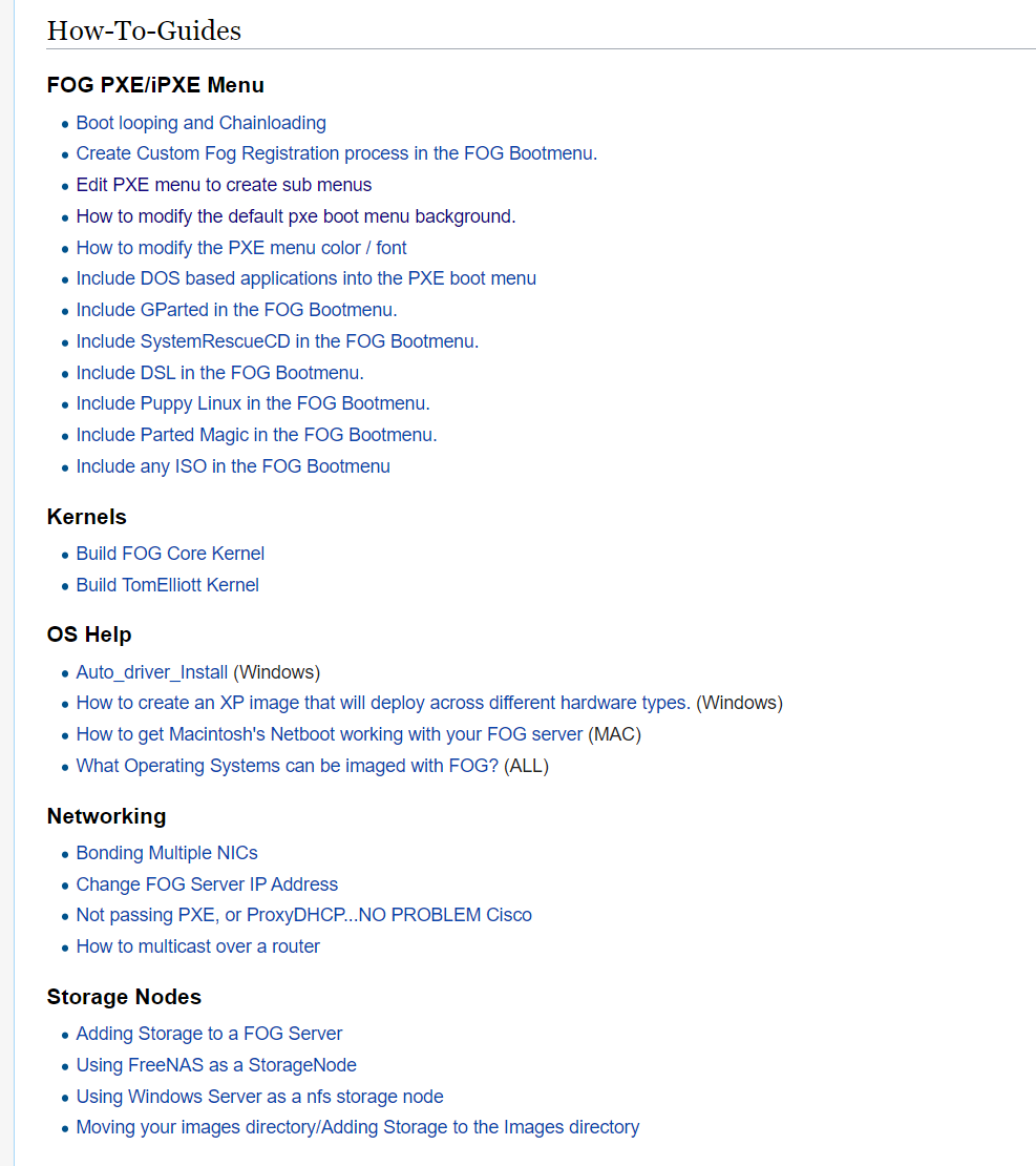
each link being an individual page. We could probably combine each of those headings into a single grouped index page the way we’re doing the current pages. But they would each have another subfolder in one of the top level folders. i.e.
customization\ipxewould have an index.rst that would combine all the pages underFOG PXE/iPXE MenuBut we currently are breaking documents into their own rst files at the heading 2 level, but we probably don’t want a gigantic customization page even with navigation. Perhaps we have some more pages like the root index.
Or maybe we should just follow examples of existing pages like https://docs.readthedocs.io/en/stable/index.html and giving a bigger overview at the top level and maintain the title/sub-title level navigation sections throughout on the left panel.
Just trying to get this right before we’re in too deep and changing it becomes a huge pain.
-
Sub-folders sound fine.
Where might these fit in? -
@JJ-Fullmer said:
Just trying to get this right before we’re in too deep and changing it becomes a huge pain.
Absolutely right to think about structure before we rush into it. On the other hand it can still happen that we decide one way and figure out there is a better way later on. To get an idea on what is possible I looked through some other projects documentation (just a random search on the web) and found a couple that might help us decide.
-
https://jupyter.readthedocs.io/en/latest/ - top bar menu for top level and side bar menu for 2nd & 3rd level plus the in page references on the right side - definitely check out the code on github as well for directory structure ideas.
-
https://python-gitlab.readthedocs.io/en/latest/ - similar complex structure but way less clear compared to the above one I find.
-
File and directory structure seems to be fairly clear in this project as well.
@Wayne-Workman said:
Where might these fit in?
I would see those three in the FAQ section, what do you think? Maybe we’d structure FAQs a bit as well so we don’t end up with a list of 50 unsorted FAQs.
-
-
The theme used by jupyter is called pydata-sphinx-theme. The more I look at it the more I like it. What do you think @JJ-Fullmer @Jurgen-Goedbloed @Wayne-Workman?
-
@Sebastian-Roth said in Improve documentation:
I would see those three in the FAQ section, what do you think?
I think putting them in FAQ is fine, though the ones on
fogsettingsandpassword_centralseem more like documentation that frequently asked questions.migrate_fogis more like a procedural thing. Though long as they get in there somewhere, it works. -
@Sebastian-Roth I kind of like it, it doesn’t appear to have to think I like about the default read-the-docs theme with the expanding sidebar
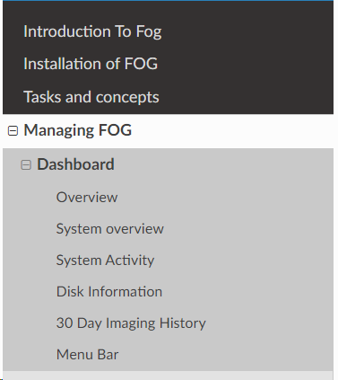
But that example also doesn’t have a ton of section levels, so I’ll give adding it a go and see what it looks like for us. The Jupyter page seemed to be loading a bit slower than other ones, but that is probably unrelated to the theme. I mean we could also customize our own theme and make it look like for 1.6’s gui. But that could be a separate project.
@Wayne-Workman
For at least the .fogsettings page, we’ve already go that in the reference section I believe https://fogproject.readthedocs.io/en/latest/reference/index.html#the-fogsettings-fileI like the FSCrawler, and ansible, and readthedocs documentation tree structure layouts the best myself. Having a few very top level things to break up and organize the rest. Then it expands on down.
I think as long as we get the general structure agreed upon, changing up the order of things or adding new sections will be simple.
-
@Sebastian-Roth I tried to install that theme per the instructions in their git to no avail. I tried following some of the example site’s configs too and haven’t got it to work yet. I think it’s worth getting, just keeping you updated.
Edit
It wasn’t working because I had a dyslexic moment and because they were missing steps in their instructions
installs with
pydata-sphinx-themebut then you define it as your theme withpydata_sphinx_themethose silly underscores and dashes.
I also had to add a html_context section and a html_theme_options sections in theconf.py. And I had to manually copy over the_templatesfiles from the theme’s repo into our project. But I got it working. It changes things up a little bit but it’s fixable, it’s just a question of what makes the most sense.There are still some kinks to work out but I think I like it.
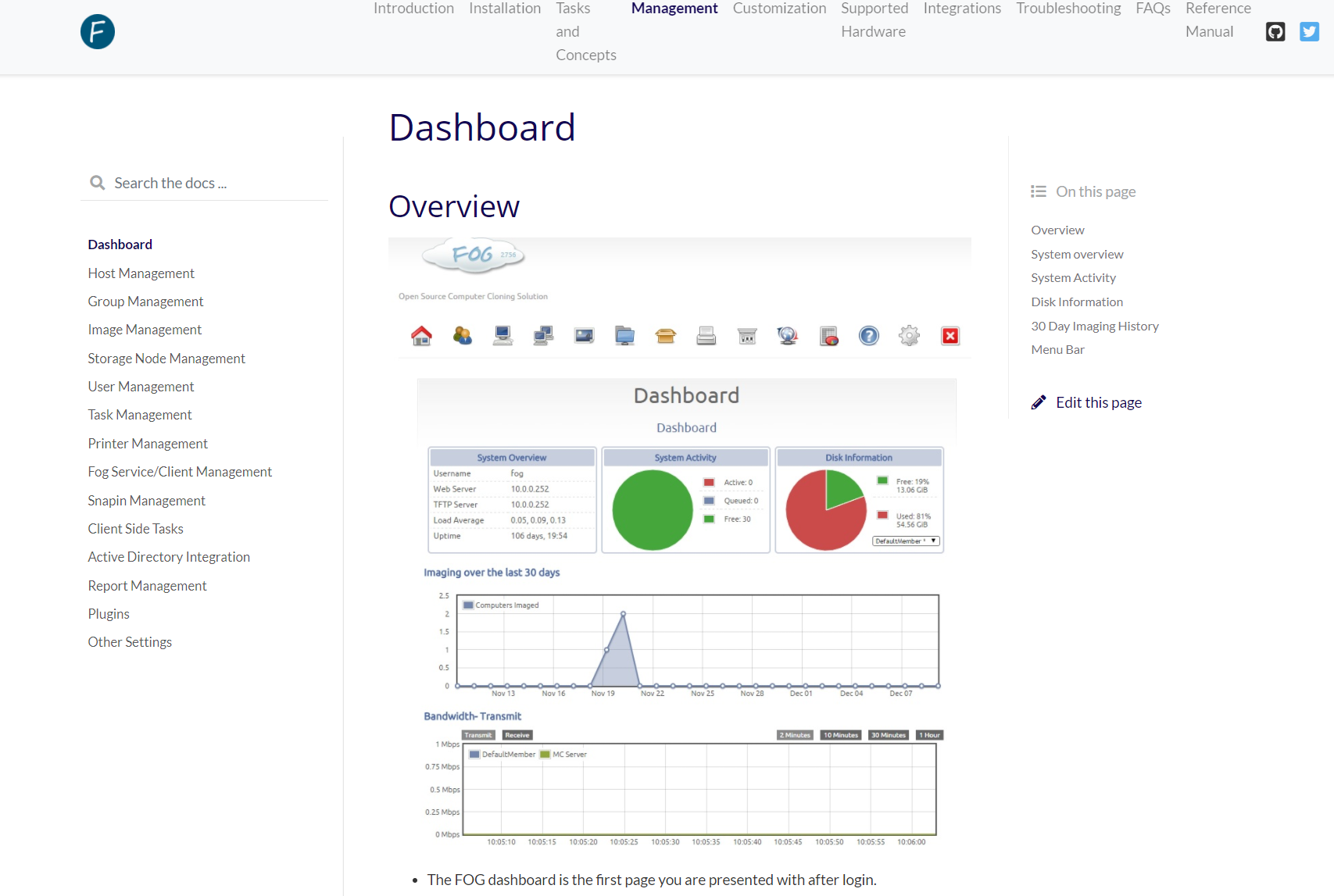
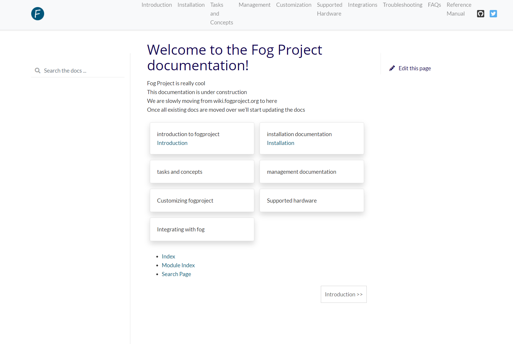
It ends up looking like this
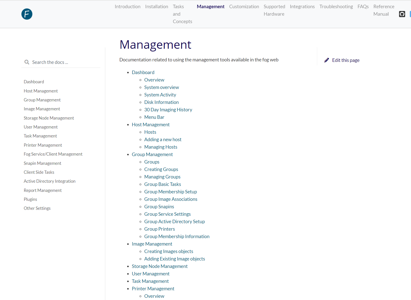
The front page is still very much a rough draft. But we could have something like this as exists in many other pages using this theme. Note the little panels. I figure we could have links to each top level section with a brief summary of what information is in each section.
This also changes it from combining pages into one index to more individual pages. It can be a bit easier to navigate this way and you still keep that information grouped together nicely in this theme. This is a nice find @Sebastian-Roth. All the themes I played with outside the default removed the read-the-docs version modal. This one is pretty great
-
@Sebastian-Roth I’ve almost got a decent prototype of our docs with that theme live. There are some things that aren’t working and I haven’t sorted out why yet. Mainly the floating ‘what’s on this page’ on the right doesn’t seem to float when you scroll on our site. Trying to find the css or js that is missing. But other than that I like this theme. It changes our structuring a bit but makes it more flexible.
-
@JJ-Fullmer Looks really great I find. Thanks for picking this up a working on it!
-
@Sebastian-Roth @Jurgen-Goedbloed I have got the new theme working with scrolling toc and all. I think the top menu needs a little tlc https://fogproject.readthedocs.io
Do we want to stick with this theme or revert back to the default theme, I know @Jurgen-Goedbloed mentioned he didn’t like it as much. I don’t want to go changing the readme with the structural changes if we’re not gonna stick with this theme. Personally I didn’t like it at first but it’s grown on me and it’s pretty easy to navigate.
-
The theme has been reverted for now. I have made a top level tree and structured things per the sphinx and rtd recommendations.
Since it’s now following the structure it’s designed to use, switching themes down the road should be easy breezy. -
@Jurgen-Goedbloed @JJ-Fullmer We have the DNS entry now. https://docs.fogproject.org/en/latest/